Interpreting Attribution Results
Results will become available after a campaign ends. In order to view results, navigate to the particular Study and scroll down to the Results section.
Overall Rates
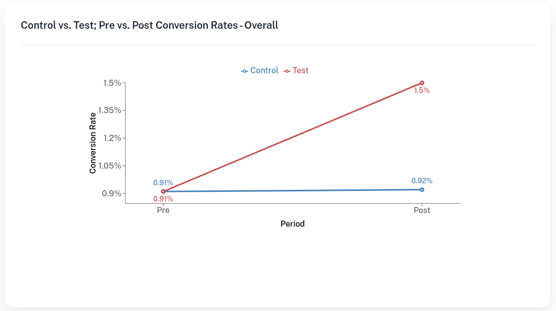
One graph typically presented at the beginning of a report is the Overall Rates chart. This shows one blue and one red line, which correspond to the Control group and Test group respectively. We show the conversion rates for each group in the Pre and Post periods

Net Lift Graphs
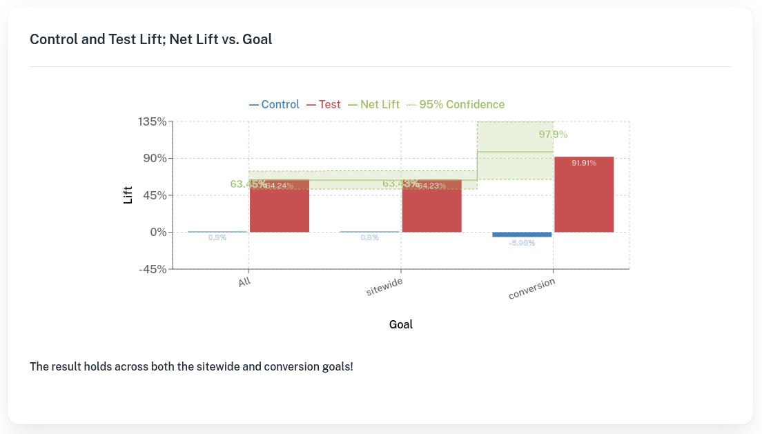
These graphs show one red and one blue bar, which correspond to the lift in the Control and Test groups respectively. These are the lifts either group experienced from pre to post. The difference between these two is called Net Lift, and is shown in the green stepped line. This is the primary result that determines if a campaign was successful. Finally, we show a 95% confidence interval around the net lift in green.

Updated 6 months ago
